Stupid Logo change at Memorial

Yah I really need to vent some fustration. So here's the deal.
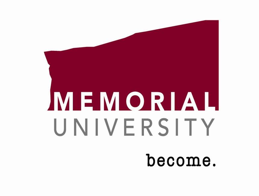
We went from the Left Logo...professional, classy, typical of a University...to the Right Logo.
What the hell are they thinking???? We are no longer Memorial University of NEWFOUNDLAND, it's just MEMORIAL university. How can you not expect that to tick the newfies off? Not to mention the "sideways" Alberta-looking formation for the logo itself. What kinda message is this supposed to send to prospective students? "We are the land of 'wanna-be Albertans' who have absolutely NO sense of innovation and creativity? We don't want the world to notice that we are geographically located in Newfoundland because this could somehow give us a bad image?" What kinda crap is this?
The reasoning given to us infuriated students is that this will " simplify global communications by making our name more open and easy to international countries". They compared this to Dalhousie, short hand DAL, and the McGill University, Shorthand McGill. First of all, Memorial isn't popular or big enough to just have a shorthand like these universities. Most people kow where McGill and Dalhousie are because they are highly prestigious Universities. Memorial isn't quite there yet. I mean, it's like Harvard or Yale. They don't NEED to include where they are geographically located because everybody has heard of them. If I say, "yah I go to Memorial" people are like, Huh? Where is that? But if I say I go to Memorial University of Newfoundland they say oh in Newfoundland? Wow never heard of it, how do you like it there?
In regards to simplicity, Memorial Unversity of Newfoundland already had a short hand - MUN. This is simple, a lot more simple than MEMORIAL. Now what is it going to be? MEM??? MU????? Wow that sounds even better! And what does this simplify? How does this attract international students? Now, prospective students have to LOOK UP where Memorial is actually located and THEN try and find it on a map. Before, all they had to do was look at a map! Basically, this idea is suppose to set Memorial University apart from all the other univerisites by being the first to really change their logo into something more modern and simple in a more globalized world. I think it sets us apart alright, and not in a positive way.
The old slogan used to be "Come East. Go Further". Now it's just "become". Become what?????? Become a welfare case? Become a prostitute? I mean, seriously! Become what? "Become" has absolutely no sense of direction what so ever! There is no competitive edge to the word 'become'. Even the old slogan, which I admit was kinda gay, was at least somewhat motivating. Go further, as in, come here instead of somewhere else. Now it's just become. I can become whatever, anywhere. I don't need to go to "Memorial" to do that. How does this set us apart from the other universities? Why should I choose Memorial over say, Dalhousie or McGill? That's what a slogan should address! I mean, common. The point of a slogan is to motivate and navigate people TOWARDS whatever you are marketing. This slogan does nothing of the sort! "Become?" How about this: I BECAME very mad when I read about this, and I will BECOME even more furious if it is not changed! Ok ok, I'm not that mad about it, but you get the picture.
Ok so back to the Logo. What the heck is that blocky thing? As my sister said, it looks like someone tried to draw a square, but got distracted and looked down to realize they had drawn nothing but a wavy line. Then this person decided to say OH MY GOD! What a great idea!!! This can symbolize the transition of student life....from rocky and hard in the beginning and lower stages, to a more smooth path in the later and higher stages. How freaking GAY! It would look more professional if it were just a solid, straight-lined, rectangular shape instead of jagged and messy. And I'm sorry but many students all over world go through this, not just Memorial students. This is a known fact. We do not need to market this type of information. If anything, it can be discouraging. Not to mention, not EVERY student will experience this type of transition. So this logo will mean NOTHING to them. Again, it does not set us apart from the other universities. This is just wrong! And they spent $165,000 on this!? The money obviously didn't go into the Logo itself, but into someone's POCKET instead!
I agree with and even like the motivation behind the change. I just don't like the finished product and I certainly do not think it represents or justifies spending $165,000. Something MORE could have been done here. Something that truly symbolized, in a modern way, what MUN is all about. And I don't believe we have to change the face of Memorial to accomplish this. Personally, I think that they should of just had a competition for the students at Memorial. Give a small money incentive and save yourself $165,000. Then let the people who matter, the people who KNOW what Memorial is about through first hand experience, decide what the logo should be and what it should represent. The students are what matter, not some stiff-necked marketing board. Hell, I would do it for free if it meant we'd have a better logo! I feel ashamed to be represented by this image and slogan. It's absolutely dreadful.
And the worst part? Changes are already set in motion. There is no turning back at this point. No one wants the change but Memorial doesn't want to feel like they've wasted their money, so this fall the logo at the top right corner of this post will be plastered on every pamphlet, booklet, and even the merchandise.
So now, I have to run to the bookstore on Tuesday to buy a sweatshirt that says "MUN" on it before they all sell out and replace them with new crappy-logo ones. But at least this way I will have some kind of university memorabilia that doesn't SUCK!
Later.
posted by PharmacyChick @ 8:20 PM
3 comments
![]()
![]()


3 Comments:
Holy crap, how can you write so much about a stupid little logo? lol
When you are a student, the smallest things intrigue you, especially those concerning the school in which you attend. And look at the logo. Isn't it STUPID?
I mean common, you have to admit, it's freakin stupid.
Well, someone has to vent about this sort of thing because in Newfoundland, no one speaks up??? Therefore, things go by the way side because hey, you wouldn't want to cause a fuss would you???
The logo sucks....
MOM - Born and raised in NEWFOUNDLAND....
Keep MUN MUN
Post a Comment
<< Home